Entrepreneurs, designers and thinkers can always use some inspiration to create innovative ideas. As a graphic designer, I often look to the pioneers of my field for ideas on creative problem-solving. Each of these figures offers important lessons not just in design, but also in innovation that can apply to anyone working on new methods, products or experiences. Here are a few ways these icons can inspire you to create something new:
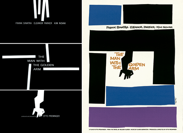
Saul Bass: The Man with the Golden Arm film titles and poster, 1955
1. Focus on neglected areas. – Saul Bass
Before Saul Bass, movie titles were considered so unimportant that theater curtains weren’t pulled aside until they were over. When Otto Preminger’s The Man with the Golden Arm was released in 1955, featuring Bass’s minimal, animated title sequence, projectionists were actually instructed to open the curtain before the credits began.
Rather than spotlighting the movie’s star, he would develop symbolic images to represent the film’s meaning. For The Man with the Golden Arm, starring Frank Sinatra as a card dealer addicted to heroin, abstract paper cutouts enter the screen at different angles while the brassy score plays. At the end, the cutouts change into a distorted arm, the film’s main symbol. For the first time, the title sequence set the mood and became part of the movie. Bass later designed classic titles for Psycho, Vertigo, North by Northwest and Goodfellas, among others.
Bass also changed the way films were marketed by creating a comprehensive and consistent suite of materials, from on-screen titles to posters to advertising. He brought that same iconic visual approach to his corporate identity work for Continental Airlines, AT&T and Warner Communications, some of which are still in use today.
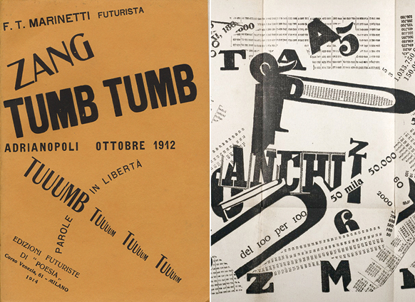
Filippo Tommaso Marinetti: Cover for Zang Tumb Tumb poetry book, 1914; “Une assemblee tumultuese” (A Tumultuous Assembly) foldout, 1919
2. Break the rules. – Filippo Tommaso Marinetti
Although better known as a poet, Italian Futurism founder Filippo Tommaso Marinetti brought a new form of expression to this literary art by breaking all the rules of typography. His “Futurist Manifesto,” published in 1909, called for a revolution in art, poetry and design. He called for the demolition of traditional means of creating and urged artists to embrace the speed, mechanical processes and violence of the industrialized world.
He published his first book, Zang Tumb Tumb, in 1914. Based on his experiences during the Balkan War of 1912, the title is a graphic representation of the mechanized sounds of gunfire, grenades and other weapons. It was one of his experiments in “words in freedom,” where he broke away from conventional linear writing by using only nouns—no adjectives or verbs. Defying traditional typography, he designed the cover using a mixture of typefaces at varying scales and angles and scrambled around the page. He pioneered expressive typography, giving it a pictorial quality; his words looked the way they sounded. Graphic design still reflects his profound influence.
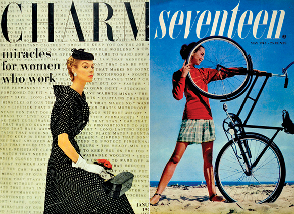
Cipe Pineles: Charm cover, 1954; Seventeen cover, photographed by Francesco Scavullo, 1948
3. Persevere. – Cipe Pineles
Today, women make up around half of the graphic design profession. But when Cipe Pineles was looking for her first design job in the 1930s, prospective employers were interested in her portfolio—until they learned that the unusual first name belonged to a woman.
She kept trying, though, and eventually became an assistant to Condé Nast’s art director Mehemed Fehmy Agha in 1932, expanding her role there over the next 15 years. She became art director at Glamour in 1942, the first female to hold that position at a major American magazine. She moved on to Seventeen, and in 1950, Pineles became art director at Charm, a magazine targeting a new demographic: working women. She designed fashion spreads showing the clothes in use—at work, commuting and running errands. “We tried to make the prosaic attractive without using the tired clichés of false glamour,” she observed in a later interview. “You might say we tried to convey the attractiveness of reality, as opposed to the glitter of a never-never land.” Her work helped to redefine the look of women’s magazines, while also furthering women’s changing roles in society.
Pineles was also the first woman inducted into the New York Art Directors Club and the first female elected to its Hall of Fame. During a career of many firsts, Cipe Pineles led with her work, and she led by example. She never gave up.
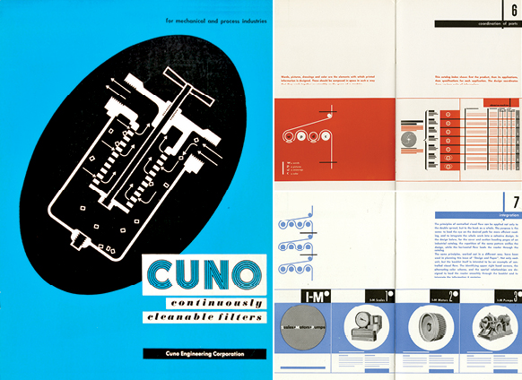
Ladislav Sutnar: Catalog cover for Cuno Engineering Corporation, 1946; Design and Paper booklet spreads, 1943
4. Collaborate. – Ladislav Sutnar
Czech designer Ladislav Sutnar moved to New York in 1939 and soon met writer/architect Knud Lönberg-Holm, who would become his partner in developing new methods of designing information for business.
They worked together to improve Sweet’s Catalog Service, which compiled the catalogs of different manufacturers in the construction industry. Recognizing that people look for products in different ways, they developed a system that cross-referenced each item by company, trade and product name. Sutnar clarified the vast amount of information, using colors, shapes, charts and graphic symbols to guide the reader. He established hierarchy by emphasizing type—changing scale and weight, reversing out of color, and using italics and parentheses—which made skimming, reading and remembering easier. (He also established the standard protocol of putting phone number area codes in parentheses.) His designs weren’t just visually interesting, but also helpful.
Sutnar and Lönberg-Holm, who also collaborated on three books to guide designers, worked at developing a visual language that communicated directly. Charts, graphs and images simplified information, helping busy people save time. The way they steered readers through complex information sounds much like what we now call information design or information architecture, which has been further developed by Edward Tufte and Richard Saul Wurman, as well as by digital and web designers everywhere. Neither Sutnar nor Lönberg-Holm could have accomplished all this on his own; each benefited from the other’s expertise.
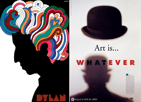
Milton Glaser: Bob Dylan poster, 1966; School of Visual Arts poster, 1996
5. Understand history. – Milton Glaser
After graduating from the Cooper Union in 1951, Milton Glaser went to Italy through a Fulbright scholarship. At the time, modernism was the prevailing style in design. Studying under painter Giorgio Morandi transformed Glaser’s views on design. He learned to respect the past and to draw inspiration from ideas and movements that actually came before the Bauhaus. Glaser had nothing against modernism; he just felt it had run its course for innovation and expression. Instead, he embraced historical styles, ornament and complexity.
In 1966, Glaser designed a poster that was included with Bob Dylan’s Greatest Hits album: a simple silhouette of the singer/songwriter’s profile, inspired by a Marcel Duchamp self-portrait, brought to life with a rainbow of curls, some Art Nouveau influence, and a custom typeface. The album sold millions of copies, making the poster one of the most widely distributed in history (though Dylan himself apparently never liked it).
One of Glaser’s many strengths is his versatility. He founded New York magazine with journalist Clay Felker in 1968, art directing it for nine years. It became the blueprint for city magazines all over the country. Glaser also designed the ubiquitous “I Love NY” logo. His love of food led to graphic and interior design projects for restaurants and supermarkets, and his teaching and writing have contributed greatly to the field. He still works today, recently revisiting the trippy 1960s for an advertising campaign for the TV show Mad Men.
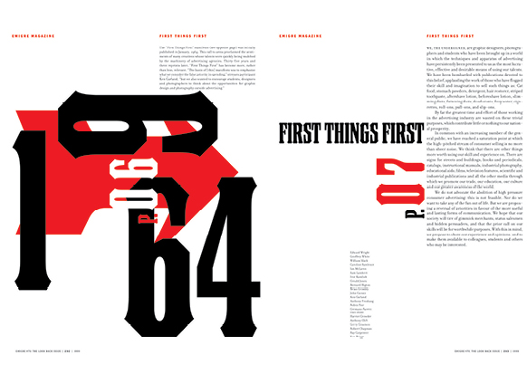
Rudy Vanderlans and Zuzana Licko: Emigre magazine spread, 1999
6. Embrace new technology. – Rudy Vanderlans and Zuzana Licko
Apple broke new ground in 1984 when it introduced the Macintosh computer. Designers Rudy VanderLans and Zuzana Licko did the same (albeit on a smaller scale) with Emigre magazine. While many designers initially resisted the computer, VanderLans and Licko embraced it, though in different and complementary ways: VanderLans liked the freedom it gave him in designing layouts, while it gave Licko a disciplined method for designing type.
Emigre magazine quickly became a forum for designers, especially those interested in experimentation and technology. It featured in-depth articles and visual essays, in layouts that broke all the rules—with varying type sizes, overlapping layers, text columns crashing into each other and distorted letterforms, all techniques that the Mac made easier. VanderLans and Licko sold their type designs to fund the magazine (which meant they didn’t have to cater to advertisers).
Those typefaces were an important part of the magazine’s design as well. After the first two issues, the magazine was set exclusively in Emigre fonts. Licko began with rough, pixilated typefaces, like Oakland, and progressed to more versatile fonts, like the popular Mrs Eaves. The magazine ceased publication in 2005, but Licko continues designing fonts, and VanderLans designs the type specimens.

Muriel Cooper: “Information Landscape,” MIT Media Lab’s Visible Language Workshop, 1994
7. Switch gears. – Muriel Cooper
Muriel Cooper had two design careers: first as a print designer and second as a groundbreaking digital designer. Beginning in 1952, she worked for MIT’s Office of Publications and eventually became art director for MIT Press. She designed many classic books, as well as the publisher’s iconic logo.
Cooper took her first computer class at MIT in 1967, and it bewildered her. However, she could see the computer’s potential in the creative process and soon began the second phase of her career: applying her design skills to computer screens.With Ron MacNeil,Cooper co-founded the research group Visible Language Workshop in 1975, which later became part of MIT’s Media Lab. She encouraged her students to use technology to present well-designed information.
Cooper presented the group’s research at the influential TED5 (Technology, Entertainment, Design) conference in 1994. For the first time, computer graphics were shown in three transparent dimensions, which moved, changed sizes and shifted focus, instead of the standard Windows interface of opaque panels stacked like cards. She made a big impact: Even Microsoft founder Bill Gates was interested in her work. Unfortunately, she died suddenly soon after, but her legacy in interactive design continues.
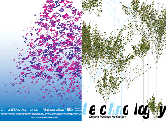
John Maeda: MIT Math Department poster, 1998; Exhibition poster for Ginza Graphic Gallery, 2002
8. Make the world more humane. – John Maeda
John Maeda, now a Design Partner at Kleiner Perkins Caufield & Byers, was a computer science grad student at MIT on his way to becoming a user interface designer. Then he read Thoughts on Design by Paul Rand—an experience that made him realize that understanding the computer did not necessarily make one a good designer. That motivated him to study graphic design, where he added traditional design skills and concepts to his knowledge of computers.
Maeda returned to MIT to teach and founded the Aesthetics and Computation Group at the Media Lab. It was there that Maeda explored the area where design and technology meet. For Maeda, the computer is a tool and a medium. Through the Media Lab, Maeda created digital experiences like The Reactive Square, in which shapes responded to sound, and Time Paint, a time-based program of flying colors. His Design by Numbers project encouraged designers and artists to learn computer programming.
Maeda, who was president of Rhode Island School of Design from 2008–2013, considers creative thinking as important as technical capability in developing the leaders of tomorrow. To the emphasis on science, technology, engineering and math (STEM) throughout the country’s educational system, Maeda proposes adding an A for Art, to create STEAM. His goal? Not to make the world more high-tech, but to make it more humane.
Related: Top of Mind: How Do You Wake Up Your Creative Side?
Portions excerpted from Graphic Icons: Visionaries Who Shaped Modern Graphic Design by John Clifford. Copyright © 2014. Used with permission of Pearson Education, Inc. and Peachpit Press.


